
We often see businesses pouring massive budgets into driving traffic to their websites. They run brilliant campaigns, rank well on search engines, and generate thousands of clicks. Yet, when they look at their sales dashboard, the numbers simply do not add up.
The immediate reaction is usually a desire to tear the whole website down and start from scratch. We believe this is a costly mistake. High traffic with low sales is rarely a marketing problem. It is almost always a conversion optimisation problem.
A beautiful website that does not generate revenue is just expensive digital art. To turn complexity into commercial clarity, we need to look closer at the user journey. The truth is that you do not always need a massive overhaul. Often, it is the smallest design tweaks that turn hesitant browsers into confident buyers.

There is a persistent myth in the digital space that doubling your sales requires rebuilding your platform from the ground up. In reality, massive redesigns introduce new risks. They can alienate existing customers who are used to your interface and disrupt your current search rankings.
We find that incremental improvements yield far better commercial returns. By isolating specific bottlenecks in the customer journey, you can make targeted adjustments. A slightly larger button, a simplified checkout form, or a better product image can drastically improve your website usability without the cost of a full rebuild.
People do not read websites like they read books. They scan them. When a potential customer lands on your page, their brain is subconsciously looking for visual cues to tell them what to do next. This is where design psychology becomes your most powerful commercial tool.
Users make snap judgements in milliseconds. If your layout is cluttered or your value proposition is buried under heavy text, cognitive load increases. When cognitive load gets too high, the user simply leaves. The goal of effective UX design is to make the buying decision feel effortless.
Think about walking into a Woolworths Food store versus a disorganised shop with stock piled from floor to ceiling. Both sell food, but in Woolworths, the lighting guides your eye, the signage tells you exactly where to go, and the layout nudges you toward high-margin items without you even noticing. Your website needs to function the same way.
In web design, friction is any element that slows a user down or makes them think too hard. It is the enemy of ecommerce optimisation. Every extra click, confusing menu item, or slow-loading graphic gives the user a reason to abandon their cart.
To improve user behaviour metrics, we must ruthlessly eliminate friction. This means anticipating what the user wants and serving it to them instantly. If a customer has to hunt for your pricing or shipping details, you have already lost the sale.
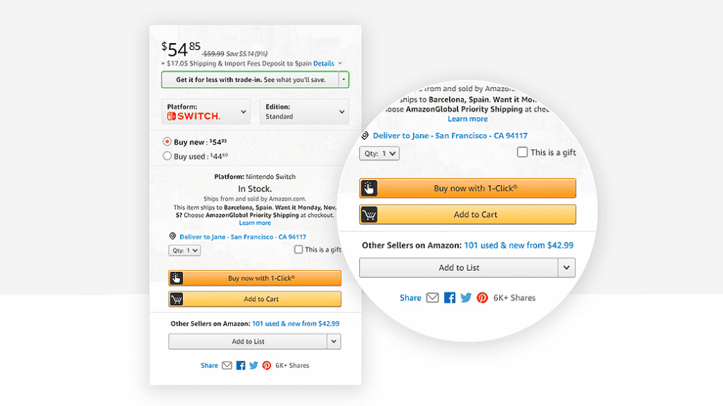
Amazon famously patented their “1-Click Ordering” system precisely to eliminate purchase friction. By removing the need for customers to re-enter shipping and payment details each time, Amazon reported that the feature contributed to a measurable increase in impulse purchases and overall revenue. The concept was so commercially valuable that they held the patent for nearly 20 years and even licensed it to Apple for the iTunes Store.
We see many brands fall into the trap of trying to be too clever. They use abstract language and overly complex animations to stand out. However, if a visitor cannot figure out exactly what you sell within three seconds, your creativity is costing you money.
Clarity will always outperform cleverness. Your headlines should state exactly what commercial problem you solve. Use straightforward language that resonates with your target audience. In the South African market, where consumers appreciate directness and value, clear communication builds immediate trust.
Visual hierarchy is the way we organise elements on a page to guide the human eye. It tells the user what is most important, what is secondary, and what they should click. Without a strong visual hierarchy, all elements compete for attention simultaneously.
You can control this hierarchy through size, colour, and spacing. The most critical elements,like your main value proposition and primary call to action, should demand the most attention. Secondary information should be visually subdued to prevent distraction.
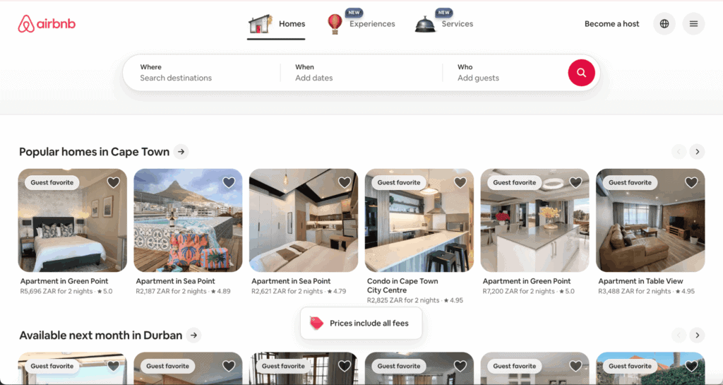
Airbnb is a masterclass in visual hierarchy. On their homepage, the search bar dominates the screen with a large, central placement and a bold accent-coloured search button. Secondary navigation items like “Experiences” or “Services” are visually smaller and positioned after the primary action. This deliberate hierarchy guides the user’s eye to the single most important action: searching for a place to stay. It is one of the reasons Airbnb’s homepage consistently achieves high engagement rates.
A successful web page never leaves the user guessing. Every single page on your site should have a singular, primary goal. Whether it is adding an item to a cart, filling out a lead form, or downloading a brochure, the next step must be painfully obvious.
We use negative space, or white space, to draw focus to these critical actions. By removing clutter around your key conversion points, you give the user a clear path forward. This subtle guidance is the cornerstone of effective conversion optimisation.
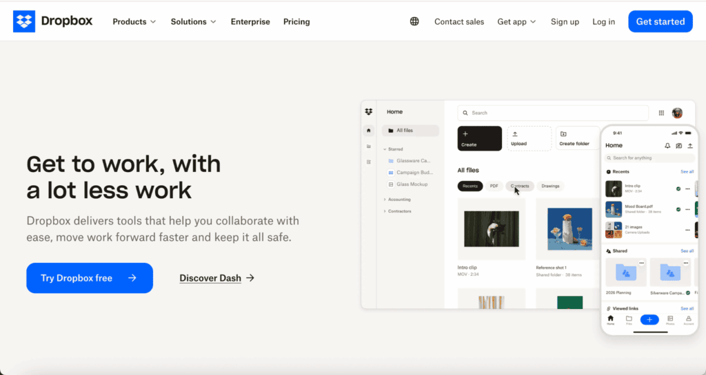
Dropbox built their entire early growth strategy around a radically simple homepage. When most cloud storage competitors were listing dozens of features on their landing pages, Dropbox used a single headline, a short explainer video, and one prominent “Sign up for free” button surrounded by generous white space. The result was a sign-up conversion rate that helped them grow from 100,000 to 4 million users in just 15 months.
Your navigation menu is not a storage closet for every page on your website. It is a roadmap. When menus are overloaded with options, users experience choice paralysis. They become overwhelmed and often choose to do nothing at all.
Streamline your navigation by categorising products logically. Use broad categories that drill down into specific subcategories. The easier it is for a user to find what they are looking for, the faster they can transition from browsing to buying.
Takealot, South Africa’s largest online retailer, overhauled their navigation structure to use a mega-menu system with clearly defined top-level categories like “Electronics,” “Home & Kitchen,” and “Beauty” that expand into logical subcategories. This approach replaced a previously text-heavy dropdown and made product discovery significantly faster for their millions of monthly users. The result is a browsing experience that mirrors how shoppers naturally think about product categories.

Forms are the ultimate hurdle in the customer journey. Nobody enjoys filling them out. If your checkout or lead generation form is too long, your conversion rate will plummet. We recommend stripping forms down to the absolute bare minimum.
To optimise your forms for higher conversions, consider implementing these key adjustments:
South Africa is fundamentally a mobile-first digital economy. The majority of your users are browsing your site on their smartphones, often while navigating fluctuating network speeds or loadshedding schedules. If your website performance is poor on mobile, you are losing a massive segment of your market.
Heavy images, complex scripts, and unoptimised code drain mobile data and drastically increase load times. A delay of just a few seconds can cut your conversion rate in half. Compressing images, leveraging browser caching, and ensuring your mobile layout is flawless are non-negotiable tweaks for modern web design South Africa.
Vodacom South Africa invested heavily in optimising their mobile web experience after internal analytics revealed that over 70% of their website traffic came from mobile devices. By compressing images, implementing lazy loading, and reducing server response times, they significantly improved their page load speed. In the South African context, where users are often on 3G or LTE connections with limited data bundles, this kind of optimisation is not a luxury but a commercial necessity.

Before a user hands over their credit card details or personal information, they need to feel safe. Trust is the currency of ecommerce. If your website looks outdated, features broken links, or uses low-quality stock imagery, users will instinctively doubt your credibility.
Building confidence requires professional, polished design. High-quality product photography, clear typography, and a modern layout signal to the user that you run a legitimate, high-quality operation. You must look as professional online as you do in the physical world.
Consumers rarely want to be the first person to try a new product. They look for reassurance from others. Integrating social proof into your design is one of the most effective ways to boost sales. This goes beyond just having a dedicated reviews page.
We recommend embedding trust signals directly into the buying journey. Here are the most effective ways to visually reassure your users:
Booking.com is arguably the most aggressive and effective user of social proof in digital commerce. On any given listing, you will see real-time notifications like “12 other people are looking at this right now,” combined with user ratings, review counts, and badges like “Preferred Partner” or “Top Rated.” A study by Cornell University’s Center for Hospitality Research found that a one-point increase in a property’s review score on Booking.com could increase their price by up to 11% without any drop in occupancy. That is the direct commercial power of visible social proof.
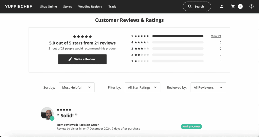
Closer to home, Yuppiechef built their entire brand reputation on authentic customer reviews. Every product on their site features real buyer reviews with verified purchase badges, and this transparency is widely cited as one of the main reasons South African consumers trust buying premium kitchenware from them online.
Inconsistencies in your design breed subconscious doubt. If your homepage features a sleek, modern aesthetic but your checkout page looks like it was built a decade ago, users will abandon their carts. They might even fear they have been redirected to a scam site.
Consistency in colours, fonts, and tone of voice across every single touchpoint reinforces your brand identity. It creates a seamless, predictable environment. When users feel comfortable and know what to expect, they are far more likely to complete their purchase.
Apple is the gold standard for design consistency across touchpoints. Whether you visit apple.com, walk into an Apple Store, open the Apple Store app, or receive a confirmation email, the typography, colour palette, and minimalist tone of voice are identical. This consistency is deliberate and meticulously enforced through Apple’s Human Interface Guidelines. It creates such a strong sense of brand reliability that Apple consistently ranks among the most trusted brands globally.
Your calls to action (CTAs) are the most important interactive elements on your website. However, many businesses make the mistake of designing CTAs that feel aggressive or out of place. A good CTA should feel like the logical, natural next step in the user journey.
The wording on your buttons matters immensely. Instead of using generic, low-commitment words like “Submit” or “Click Here”, use action-oriented copy that highlights the value the user will receive. Phrases like “Get Your Free Quote” or “Secure Your Booking” perform significantly better because they focus on the outcome.
While we want to drive conversions, we must avoid manipulative design tactics. Forcing users into decisions through confusing layouts or hidden subscription checkboxes will ultimately damage your brand reputation. These dark patterns might yield a short-term spike in numbers, but they destroy long-term customer loyalty.
Instead, guide your users with transparent, helpful design. Offer them clear choices. If an item is out of stock, provide an easy way for them to be notified when it returns. If they abandon their cart, ensure the process of returning to it later is completely frictionless.
Netflix is frequently praised for their transparent cancellation process. Users can cancel their subscription in just two clicks with no guilt-tripping language or hidden hoops. This honesty has paradoxically contributed to Netflix’s high re-subscription rate, as users feel comfortable returning because they know they can leave easily.
The final and most crucial step in any design tweak is measurement. You cannot improve what you do not measure. Assuming a design change will work based purely on intuition is a fast way to waste commercial resources.
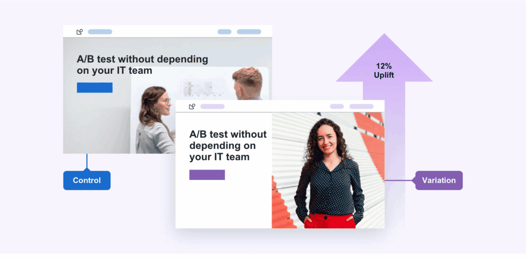
We rely on hard data to validate our design decisions. By setting up proper analytics, tracking user sessions, and running A/B tests on different button colours or headline variations, we remove the guesswork. This data-driven approach ensures that every pixel on your website serves a measurable commercial purpose.
Superbalist (a Takealot Group company) uses extensive A/B testing and user session tracking tools to continuously optimise their South African ecommerce experience. By testing variations of product page layouts, promotional banner placements, and checkout flows, they make data-backed design decisions that directly impact their conversion rate in a highly competitive local fashion market.
If you are ready to stop losing sales to poor user experiences and start designing for commercial clarity, let us optimise your digital presence.