

The modern world is loud. From the chaotic energy of downtown Johannesburg to the steady hum of notifications on our phones, we live in a state of visual and mental overload. In this environment, silence is not empty. It is powerful.
Many brands respond to this noise by trying to outshout it. They crowd every layout with messages, flood designs with colour, and stack feature upon feature in the hope of being noticed. Yet the brands that truly command attention often do the opposite. They whisper.
Design that breathes is not about removing meaning. It is about sharpening it. By stripping away what is unnecessary, we allow the core message to stand with confidence. This is where simplicity stops being a visual preference and becomes a driver of emotional connection and commercial clarity.
To understand the strength of simplicity, we need to consider how people actually process information. The human brain is highly capable, but it is also wired for efficiency. When a design is cluttered, the brain has to work harder to make sense of it. That effort creates friction.
Visual noise competes with clarity. When everything on a page demands attention, nothing truly earns it. We see this often in legacy corporate websites across South Africa, where multiple priorities are forced into a single space. The result is confusion rather than communication.
When design becomes overwhelming, users are left asking questions that should be intuitive:
Complexity breeds hesitation, and hesitation kills momentum.
Clarity is reassuring. When a layout feels open and structured, the brain relaxes. Information becomes easier to absorb and easier to remember. This is why many of the world’s most valuable brands favour restraint. They understand that confidence does not need decoration.
Simplicity also offers emotional relief. Whether a customer is banking online, booking travel, or trying to understand a complex B2B service, they are already carrying cognitive load. A design that breathes removes pressure. It signals competence and care. That sense of ease quickly becomes trust, and trust becomes loyalty.
Minimalism is often misunderstood as an easy option. In reality, it demands discipline. Every choice must be intentional. Design that breathes creates space for elements to coexist without competing.
White space is not wasted space. It is one of the most powerful tools in visual communication. Like a pause in conversation, it gives meaning weight. White space frames content, guides attention, and helps users understand what matters most.
Compare a crowded discount flyer to a luxury magazine advertisement. One fills every corner and signals urgency. The other leaves space and signals value. White space changes perception.
When copy is compressed, it stops communicating and starts blending into the background. Generous margins and thoughtful line spacing improve readability and allow messages to land properly. Space gives words time to be understood.
Strong design has rhythm. It leads the eye naturally from one moment to the next through:
This rhythm keeps users engaged without overwhelming them.
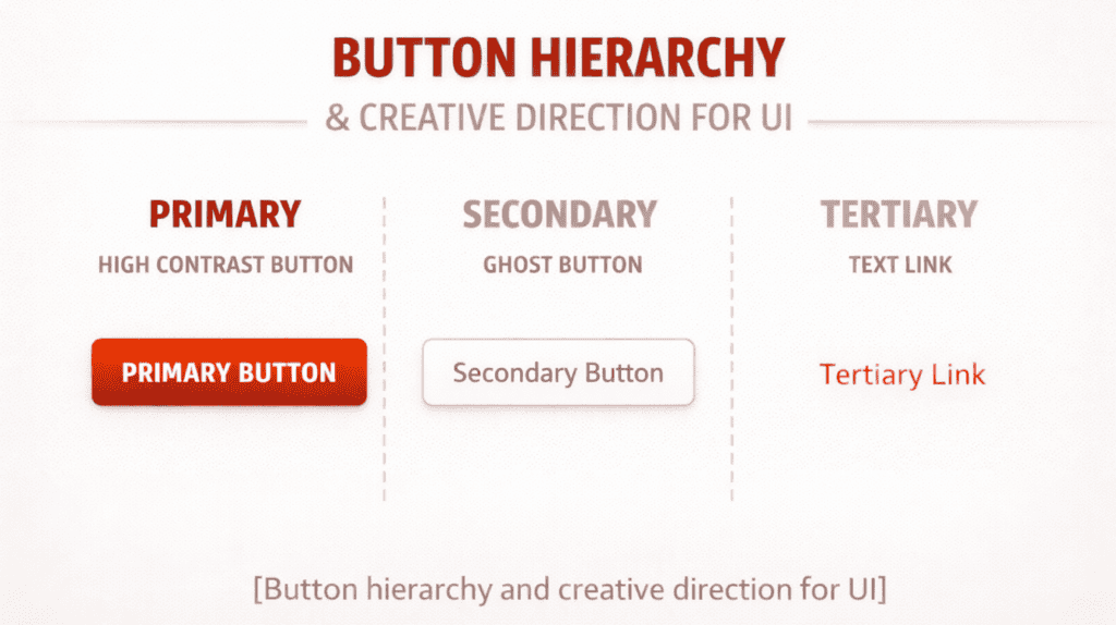
If simplicity is the foundation, hierarchy is the structure built on top of it. Without hierarchy, simplicity becomes emptiness.
Good design makes decisions on the user’s behalf. Through scale, contrast and colour, we indicate what is important and what can wait. In a mobile-first environment like South Africa, where screen space is limited and attention is short, this is essential.
When everything is the same size and colour, nothing stands out. By prioritising the headline and supporting it with a clear call to action, we create a visual path. The user knows where to look and what to do next.
Design tells a story without words. A strong hero image sets the mood. A supporting headline introduces the challenge. Body copy provides clarity. The call to action offers resolution. When hierarchy is clear, the narrative flows naturally.
Confusion erodes confidence. When users feel uncertain, they disengage. By removing unnecessary elements, we create calm environments where people feel in control. That sense of control is what allows them to commit, whether that means making a purchase or starting a conversation.
Many clients fear white space. They worry that saying less means offering less. In reality, simplicity is about choosing impact over excess.
Every element must earn its place. If it is not strengthening the brand, clarifying the message, or guiding the user, it should be removed. This level of focus is what elevates creative direction from good to exceptional.
When there are fewer elements, quality becomes non-negotiable. Imagery must be strong. Typography must be precise. Copy must be sharp. Simplicity exposes weaknesses, which is why it demands excellence.
Simplicity is not one-size-fits-all. A tech startup in Cape Town may express it through bold monochrome layouts. A heritage wine estate in Stellenbosch may use refined typography and expansive photography. The common thread is clarity, not uniformity.
Restraint signals confidence. It shows that a brand trusts its product and its message. In a market where audiences are increasingly sceptical of aggressive selling, restraint builds credibility. It allows the work to speak for itself.
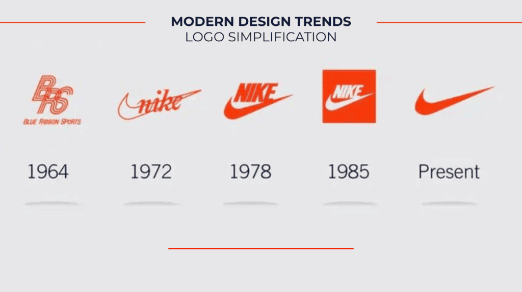
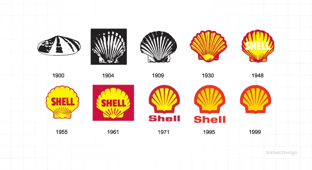
Design is ultimately about people. While algorithms matter, emotional resonance matters more. Simplicity bridges the gap between digital interfaces and human experience.
Clear design feels honest. Cluttered design feels defensive. When an interface is simple, we trust it. This is why we trust clean banking apps and intuitive healthcare portals. Trust is the currency of the digital world, and clarity is how it is earned.
Design is not just how something looks, it is how it works. A visually impressive site that frustrates users fails its purpose. A simple, intuitive experience succeeds because it anticipates needs and removes obstacles.
By reducing friction, we create flow. That ease becomes part of the brand perception itself.
Trends come and go. Visual simplicity endures. Clean typography, thoughtful composition and strong imagery remain relevant long after aesthetic fashions fade. By investing in design that breathes, brands future-proof their identity.
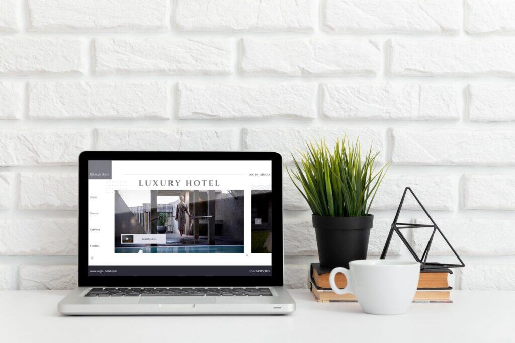
Visual simplicity is not about doing less. It is about doing the hard work of distillation. It requires deep understanding and confident decision-making. In a noisy world, the brands that choose to breathe are the ones that last.If you are ready to stop adding noise and start building clarity that converts attention into trust, let’s talk.